A waterfall chart is a type of graph that is used to show how a value progresses from one phase to another. Waterfall charts are a great way to track cumulative effects. They can be used to track the effect of revenue over time or of expenses over time. They can also be used to track the cumulative effect of any other metric over time.
Waterfall charts are especially useful when you want to see how a change in one metric affects all of the others. For example, if you want to see how a change in revenue affects expenses, you can use a waterfall chart to track the effect of those changes. They are a dynamic analysis tool that is valuable for highlighting data insights. Let’s take a closer look at waterfall charts.
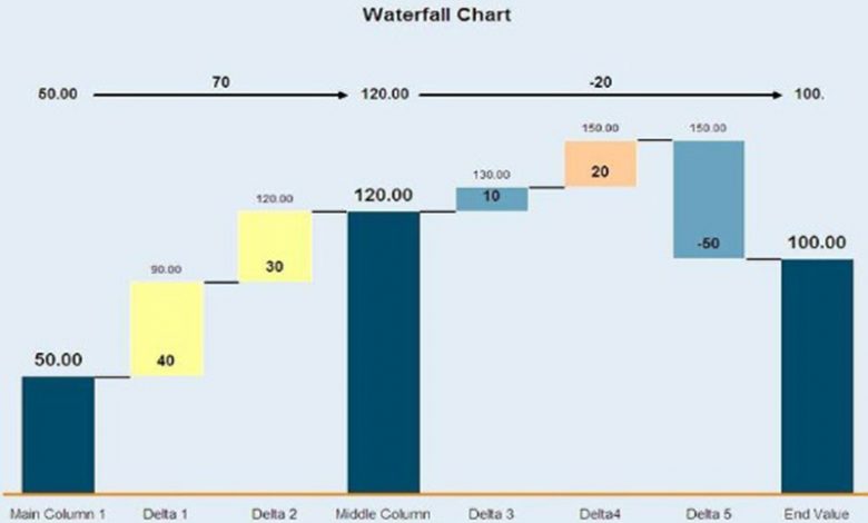
What is a Waterfall Graph?
Waterfall charts are a type of graphical representation used to display the cumulative effect of sequentially introduced positive or negative values. Waterfall charts sometimes referred to as cascade charts or flying bricks, are a special type of chart used to show how a particular value changes over time. The waterfall chart gets its name from the image that is created, which looks similar to a waterfall. The chart typically has a series of columns that represent the effect of a change in value on the cumulative total.
The waterfall chart can be used to represent financial data, such as revenue or profits, or to show the progression of values over time. In financial applications, the waterfall chart can be used to highlight how specific changes in values have contributed to the overall total. In other applications, the waterfall chart can be used to show the stages of a process or the progress of a project.
When can you use a waterfall chart?

Waterfall charts are used to illustrate how a particular value changes over time. They can be used to show how a particular value changes from one point in time to another or how it changes as a result of different factors. There are a variety of different waterfall charts, but all of them follow the same basic format. The chart typically starts with a value at the top that represents the total value of the data. This value is then divided into a series of smaller values, which are in turn divided into even smaller values. The chart then proceeds to show how each of these smaller values contributes to the total value. The final value on the chart represents the value at the bottom of the chart, which is the value for the last time period.
Waterfall charts can be used to illustrate a wide variety of different data sets. A common example of a waterfall chart is a graph showing how a company’s profits change over time. Additionally, other applications could include illustrating how a product’s sales change over time or how a customer’s total spending changes over time. They can also be used to illustrate how different factors contribute to a particular outcome. For example, a waterfall chart could be used to show how a particular event affects the total value of a data set.
What are the benefits of waterfall charts?
Waterfall charts are versatile data visualization tools and are particularly useful for displaying the impact of sequentially cumulative positive or negative values. For example, in a business context, waterfall charts can be used to show the effect of things like revenue growth, profit gains and losses, and sales growth by product lines. Waterfall charts allow you to see the cumulative effect of changes in data over time. Additionally, they can illustrate the impacts of specific values. When you utilize waterfall charts, you spot trends and patterns in data quickly.
What are the limitations of waterfall charts?
Waterfall charts are often used to track the progress of a project over time. They can be helpful for data analysis to help understand how different tasks or phases contribute to the overall goal. However, there are several drawbacks to using waterfall charts. Depending on the data and the amount of information used, they can be difficult to read and understand sometimes. Additionally, it’s possible that a waterfall chart can be misleading if there are negative values or if the values are not in order from largest to smallest. Additionally, while they are a very beneficial tool, they can be time-consuming to create occasionally.
A waterfall chart is a graphical representation of data that helps in understanding how a particular value is distributed over a period of time. Waterfall charts can also be helpful for troubleshooting and demonstrating trends over time.
Follow – https://financialapple.com for More Updates